
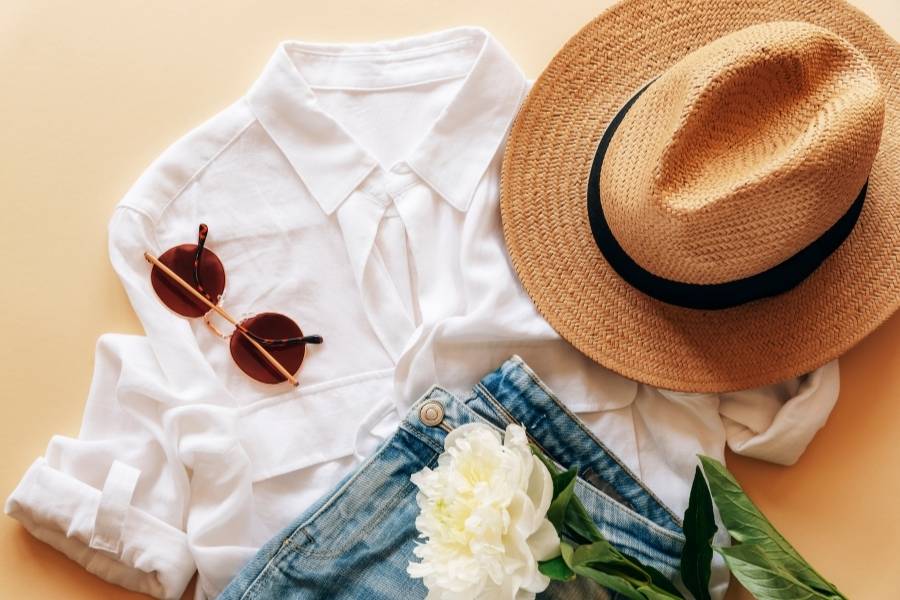
Ever stared at your closet like it’s personally betraying you? You’ve got gorgeous pieces hanging there, but somehow they refuse to play nice together. Trust me, we’ve all been there, standing half-dressed and running late because nothing looks right in Rules for Outfits.
Here’s the thing: looking effortlessly chic isn’t about owning the most expensive pieces or chasing every Instagram trend. It’s about cracking the code of color coordination rules that make your wardrobe actually work for you instead of against you.
Think about it like this – some people seem to have this magical ability to throw on any random pieces and look like they stepped out of a magazine. Spoiler alert: it’s not magic. They just understand how colors talk to each other. Once you get this, you’ll never have those “I have nothing to wear” moments again, even when your closet is bursting at the seams.
Whether you’re getting ready for a big presentation, weekend coffee with friends, or that dinner where you want to look amazing without trying too hard, mastering these color coordination rules will be your secret weapon.
The Real Deal: Color Theory Basics That Actually Matter
Let’s skip the art class flashbacks and get to what actually helps you get dressed. Color theory might sound fancy, but it’s basically just understanding which colors are friends and which ones… well, aren’t.
Picture the color wheel as your dating app for clothes. Some colors are meant to be together, others work better as casual acquaintances, and some should probably never be in the same room. The beauty is in knowing which is which.
Warm colors are like that friend who lights up every room – reds, oranges, yellows that make you think of sunshine and cozy fires. Cool colors are more like that super chic friend who’s always perfectly composed – blues, greens, purples that remind you of ocean waves and mountain views.
Here’s what most people miss: every color has a personality underneath. That navy jacket might look blue, but it could have green or purple vibes hiding in there. This is why sometimes two “blue” pieces look weird together – they’re speaking different languages.

The Undertone Game Changer
Your skin has undertones too, and this is where things get interesting. Some people look amazing in certain colors while others wash out completely in the same shade. It’s not about being fair or dark – it’s about the subtle temperature of your skin.
Cool undertones love silver jewelry and look great in true whites and jewel tones. Warm undertones shine in gold jewelry and look amazing in cream and earth tones. Once you figure out your team, shopping becomes so much easier.
The Never-Fail Color Coordination Rules for Outfits That Work Every Time
Some fashion rules are total nonsense, but these color coordination rules have staying power because they just work. Think of them as your style insurance policy.
The One-Color Wonder
Wearing different shades of the same color is like having a cheat code for looking put-together. Picture someone in a soft gray sweater, charcoal pants, and silver accessories – it looks intentional and expensive, even if nothing actually was.
Monochromatic outfit coordination is perfect for those mornings when your brain isn’t fully online yet. Grab three different shades of your favorite color and you’re golden. Navy blazer, denim shirt, powder blue scarf? Done. You look like you planned it, even if you’re barely awake.
The trick is mixing textures and shades so you don’t look like you’re wearing a uniform. Smooth silk with chunky knits, light with dark, matte with shiny – these little contrasts make all the difference.
The Neutral Safety Net Rules for Outfits
Neutrals are like the reliable friends of your wardrobe – they get along with everyone and never cause drama. Black, white, gray, navy, beige, camel – these colors are your foundation pieces that make everything else possible.
Neutral color schemes give you endless mixing options. That white shirt isn’t just a white shirt – it’s a blank canvas that makes bright accessories pop or blends seamlessly with other quiet colors.
Pick two or three neutrals that you actually like (not just ones you think you should wear) and build from there. Maybe you’re a navy-and-cream person, or more of a black-and-camel type. Once you know your neutral squad, shopping becomes way less overwhelming.
Getting Fancy: Color Matching Techniques for When You’re Feeling Bold
Ready to level up? These color matching techniques will make you look like you have a personal stylist, even if you’re just winging it.
The Opposite Attracts Method Rules for Outfits
Complementary colors sit across from each other on the color wheel and create serious visual drama. Think red and green, or blue and orange – combinations that make your eyes happy in the best way.
The secret to pulling off complementary color combinations without looking like a walking highlighter? Use them unequally. Let one color be the star and the other be the supporting actor. A coral bag with a navy dress? Perfect. A coral dress with navy accessories? Also perfect. Half coral, half navy? That’s where things get tricky.
Try the 60-30-10 rule that stylists swear by: most of your outfit in one color, less of the second color, and just a tiny pop of something else. It keeps things interesting without being overwhelming.
The Neighbor Strategy
Analogous colors are basically best friends on the color wheel – they sit next to each other and naturally get along. These analogous color schemes are perfect when you want something more interesting than all one color but less dramatic than opposites.
Think about a sunset – those gorgeous oranges melting into reds and pinks. Or ocean colors – all those blues and greens that flow together. When you translate this to clothes, you get combinations that feel natural and harmonious.
The best part? Analogous combinations are pretty forgiving. If you’re slightly off on the shade, it usually still works because the colors are already related.
Seasonal Color Coordination That Actually Makes Sense
Your color coordination rules should change with the seasons, not just because of weather but because different times of year have different energies.
Spring and Summer: Light, Bright, and Right
Warmer months are when you can play with bright color coordination without looking like you’re trying too hard. Think about what makes you happy when the sun’s shining – probably not the same colors that feel cozy in December.
Coral and mint green is one of those combinations that just screams “I’ve got my life together” in the best way. The warmth of coral balances perfectly with the coolness of mint, creating something fresh and sophisticated.
Lavender and butter yellow might sound weird on paper, but it’s actually gorgeous – like a spring garden that knows what it’s doing. The key is keeping the intensity levels similar. Soft lavender with soft yellow, or bright lavender with bright yellow – but don’t mix intensities or things get weird.
Fall and Winter: Rich, Deep, and Cozy Rules for Outfits
As the temperature drops, your colors can get richer and more dramatic. Autumn color coordination is all about those gorgeous leaf colors – burgundy, forest green, golden brown, burnt orange.
Winter opens up space for jewel tones that might feel too heavy in July. Emerald green, sapphire blue, deep ruby red – these colors have weight and richness that matches the season’s mood.
Don’t forget about texture when you’re working with winter colors. Rich colors plus luxurious textures like cashmere or velvet create depth that makes up for all that missing sunlight.
Office Style: Business Color Coordination That Gets You Noticed (For Good Reasons)
Work clothes are tricky because you need to look professional but not boring, put-together but not uptight. Your color coordination strategy needs to work overtime here.
Building Your Professional Color Story
Business color coordination starts with understanding your office culture. Creative agency? You can probably get away with more adventurous choices. Law firm? Maybe stick to more traditional combinations, but you can still have personality.
Navy is your secret weapon because it’s more approachable than black but just as professional. Navy with white is classic, navy with gray is sophisticated, navy with cream is warm and friendly.
The magic happens when you add one consistent accent color that becomes your signature. Maybe you’re always wearing something burgundy, or you’ve got a thing for forest green accessories. People start to associate that color with you, which is actually a great personal branding move.
Color Psychology That Actually Works Rules for Outfits
Colors do send messages, but you don’t need to overthink it. Red suggests confidence and energy, but a red blazer hits different than red lipstick with a neutral outfit. Blue feels trustworthy and calm – perfect for client meetings. Green suggests growth and balance – great for team collaborations.
The sophisticated approach is subtle. Instead of wearing head-to-toe power red, add red through a scarf, jewelry, or even just nail polish. The effect is there without being obvious.
Special Occasion Color Coordination Without the Stress
Events and parties come with their own color coordination challenges. You want to look amazing but also appropriate, memorable but not for the wrong reasons.
Wedding Guest Style That’s Actually Helpful
Wedding guest dressing is basically a minefield of color rules. No white (obviously), consider the venue and time of day, don’t upstage the couple, but still look fabulous. No pressure, right?
Wedding color coordination is about reading the room. Beach wedding? Light, airy colors work beautifully. Think soft blues, corals, or sage greens. Church ceremony? You might want to be more conservative with your color choices.
Dusty rose with soft gray is one of those combinations that photographs beautifully and feels appropriately celebratory. For evening weddings, you can go richer – deep burgundy with gold accents or navy with silver create that formal elegance without being too flashy.
Holiday Party Colors That Aren’t Cliché Rules for Outfits
Holiday parties are your chance to have fun with festive color combinations that might feel over-the-top any other time of year. But there’s a difference between festive and costume-y.
Instead of obvious Christmas colors, try deep forest green with gold accents, or rich burgundy with cream and silver. You get that holiday feeling without looking like you’re wearing a themed outfit.
Navy with silver and white creates this winter wonderland vibe that’s elegant and festive. Deep purple with gold is regal and perfect for New Year’s celebrations. These combinations capture the holiday spirit while keeping you looking sophisticated.
The Color Coordination Mistakes That Ruin Otherwise Great Outfits
Even people with great style sometimes fall into these color coordination traps. Knowing what to avoid is just as important as knowing what works.
Too Safe vs. Too Much
The biggest mistake is either playing it so safe that you’re invisible or going so wild that you look like a walking art project. Balance in color coordination is about finding that sweet spot.
If you’re wearing a statement piece with lots of colors, keep everything else quiet. If your base outfit is pretty neutral, don’t be scared to add one exciting pop of color. The key is having one main character in your outfit, not a whole ensemble cast competing for attention.
Ignoring How Fabrics Change Colors
This is something most people never think about, but it matters. A red silk blouse looks completely different from a red cotton t-shirt, even if they’re technically the same color. Texture and color coordination is about understanding how different materials affect the way colors appear.
Shiny fabrics make colors look brighter and more attention-grabbing. Matte fabrics make colors look softer and more sophisticated. Mixing textures within the same color family adds visual interest without creating color chaos.
Real-Life Rules for Outfits Coordination That Actually Works
All the theory in the world doesn’t help if you can’t make it work with your actual life, budget, and schedule.
Building a Coordinated Wardrobe Without Breaking the Bank
Good wardrobe color coordination isn’t about having unlimited money – it’s about being smart with your choices. Start by figuring out which colors make you feel amazing, then build around those.
Budget-friendly color coordination means choosing pieces that work multiple ways instead of buying lots of things that only work once. If you build around navy, white, and maybe coral, most of your pieces can work together in different combinations.
Before you buy anything new, think about how it’ll work with at least three things you already own. This simple rule prevents those impulse purchases that looked great in the store but have nothing to talk to in your closet.
Using Technology to Get Better at Color Rules for Outfits
Your phone can actually help you get better at color coordination. There are apps that help you identify colors and suggest combinations, plus you can use your camera to test outfit combinations before you leave the house.
Taking photos of your outfits is incredibly helpful for learning. Sometimes combinations that look good in the mirror don’t translate well in photos, and sometimes risky combinations that make you nervous in person actually look amazing in pictures.
Social media is great for inspiration, but remember to adapt ideas to your own style instead of copying them exactly. The goal is developing your own approach to color, not becoming a clone of someone else’s style.
The whole point of mastering color coordination rules is to feel confident in your own skin. Whether you love subtle, sophisticated combinations or prefer bold, creative expressions, understanding these basics gives you the freedom to create looks that feel authentically you.
The best-dressed people aren’t the ones who follow every rule perfectly – they’re the ones who understand the rules well enough to break them beautifully when it feels right. So what color combination is calling your name? Time to make it happen.